
When Filippo Tommaso Marinetti’s Futurist Manifesto exploded across the front page of Le Figaro in February 1909, readers encountered not just new ideas but a new rhythm of language. Words shouted, lines fragmented, punctuation vanished. The manifesto didn’t simply describe modernity—it performed it.
In the early twentieth century, artists and writers across Europe discovered that the printed page itself could be a weapon of revolution. Typography, layout, and design became expressions of speed, shock, and rebellion.
From the Futurists in Italy to the Dadaists in Zurich, from the Constructivists in Russia to the Bauhaus in Germany, a generation of radicals turned print into an art form that mirrored the chaos and energy of the modern world.
This is the story of how print became modern—how the page, once a stable vessel for meaning, became an arena for experimentation, ideology, and the visual drama of modern life.
The Machine Age and the End of Old Forms
A World Accelerated
By 1900, industrial society had transformed perception itself. Trains, telegraphs, and telephones compressed space and time; cities pulsed with electricity and noise.
Writers struggled to describe a world in perpetual motion. The calm, linear prose of the nineteenth century no longer seemed adequate. Something faster, more fractured, more visual was required.
The result was a revolution not just in what people wrote, but how they wrote it.
Printing the New
Typography—the design of letters—became a language of its own. The clean geometry of sans-serif fonts, the dynamic diagonals of avant-garde layouts, and the collision of word and image captured the pulse of modernity more vividly than any sentence could.
Print, long a quiet medium, began to shout.
Futurism: Words in Motion
The Manifesto as Explosion
The Italian poet Filippo Tommaso Marinetti launched Futurism as both an artistic and political movement. His Futurist Manifesto celebrated speed, violence, and the machine. It proclaimed:
“We will sing of great crowds excited by work, by pleasure, and by riot.”
Futurism rejected the past with almost religious fervour. Museums were “cemeteries,” libraries “useless.” The modern city, with its engines and factories, was the true cathedral of the age.
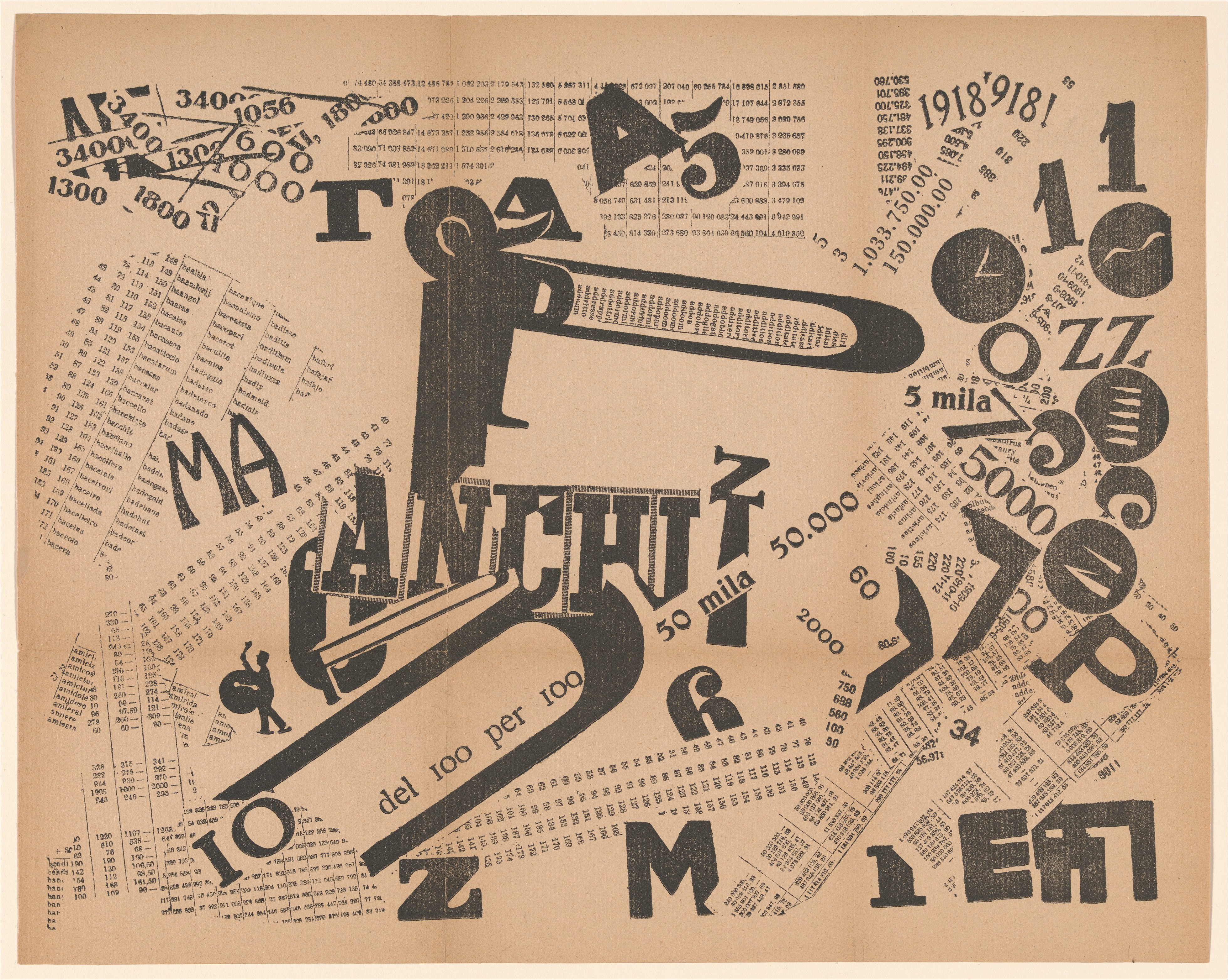
The Visual Page
Marinetti’s parole in libertà—“words in freedom”—broke from the traditional page layout. Words swelled, tilted, and collided; typefaces varied within a single sentence; punctuation disappeared.
The result was not to be read so much as experienced. The printed page became a field of sound and motion.
This radical visual language influenced everything from advertising design to political propaganda. It was the birth of what graphic designers later called “typographic expressionism”—the idea that the look of text could carry emotion as powerfully as its meaning.
Dada and the Art of Disruption
Zurich, 1916: The Cabaret Voltaire
While war consumed Europe, a group of exiles in neutral Switzerland declared war on meaning itself. The Dada movement, born in 1916, mocked reason, order, and nationalism—the very values that had led to catastrophe.
Their posters, journals, and manifestos embraced chaos. Letters were cut, pasted, rotated; nonsense words mingled with political fury. Typography became collage, fragmentation became principle.
The Anti-Art of Print
For Dadaists like Tristan Tzara and Hannah Höch, the printed page was not a vehicle for coherence but for protest. By defying the conventions of reading, they forced audiences to confront the absurdity of their world.
This spirit of rebellion later shaped Surrealism, Pop Art, and punk. The Dada page—loud, anarchic, and self-aware—became the blueprint for every cultural movement that used design as dissent.
Constructivism: Building the New Society
Revolution by Design
In the aftermath of the 1917 Russian Revolution, artists and designers asked how their craft could serve a new world. The answer was Constructivism—a belief that art should be functional, collective, and integrated into everyday life.
Figures like El Lissitzky, Aleksandr Rodchenko, and Varvara Stepanova turned to typography and photomontage as tools of social transformation.
Their posters and books fused bold geometric shapes, sans-serif type, and black-and-red colour schemes. Every page seemed to move, to command.
El Lissitzky’s 1923 work For the Voice, a book of poems by Vladimir Mayakovsky, exemplified this approach. Each spread was designed as a “typographic score,” guiding the reader’s eye like a conductor leading an orchestra.
The Politics of the Page
Constructivist design was propaganda in the purest sense of the word—art intended to shape consciousness.
But it was also international. Its influence spread through Europe and America, shaping the visual language of advertising, cinema titles, and eventually corporate modernism.
The clean, bold look of the twentieth century—what we now call “modern design”—was born in the radical workshops of revolutionary Russia.
The Bauhaus and the Grammar of Modern Design
From Chaos to Clarity
If Futurism and Dada represented explosion, the Bauhaus represented order. Founded in Weimar Germany in 1919, the school sought to unify art, craft, and industry.
For typographers like Herbert Bayer and Laszlo Moholy-Nagy, clarity was the new beauty. They abandoned decorative flourishes and capital letters, favouring simple geometric forms and logical layouts.
Bayer’s 1926 Universal Type used a single alphabet for all purposes—functional, neutral, and modern.
Typography as Architecture
Bauhaus designers saw the page as a structure to be built, not decorated. They used grids, asymmetry, and white space to create visual balance.
Their principles—simplicity, functionality, legibility—became the foundation of modern graphic design, influencing everything from subway signage to digital interfaces.
In a sense, the Bauhaus completed what Marinetti had begun: it made the modern world readable.
Modernism and the Mass Market
From Avant-Garde to Advertising
By the 1930s, the innovations of the avant-garde had been absorbed by commerce. Designers trained in the Bauhaus style now worked for corporations and magazines.
Sans-serif fonts once associated with revolution now sold soap and cigarettes. Photomontage promoted luxury goods instead of socialism.
This transformation exemplified what Walter Benjamin called “the aestheticization of politics”—and its mirror image, the politicisation of aesthetics. What began as a language of revolt became the visual vocabulary of persuasion.
The Spread of Modern Style
After the Second World War, modernist design became global. Governments used it to project efficiency; corporations used it to project trust. The International Typographic Style—also known as Swiss Modernism—translated Bauhaus clarity into a universal corporate aesthetic.
Clean lines, grids, Helvetica: these were the emblems of rational progress. But behind their neutrality lay the same utopian dream that had animated the Futurists—a belief that design could shape a better world.
Typography and Emotion
The Feel of the Page
Typography is often mistaken for mere technique, yet it shapes how readers feel before they understand.
A bold sans-serif announces modernity and confidence; an italic script suggests intimacy or nostalgia. The early avant-gardes understood this instinctively. Their pages shouted, whispered, and laughed through letterforms.
In this sense, the typographic revolutions of the early twentieth century were not only visual but psychological. They taught readers to experience words as images and to read with their eyes as much as their minds.
Reading as Performance
The manifesto form itself—urgent, declarative, typographically daring—was a performance. It invited the reader not just to agree but to act.
The energy of the printed manifesto later resurfaced in political leaflets, punk zines, and digital activism. Every tweet in capitals, every protest poster in block letters, owes something to Marinetti’s thunderous typography.
The Legacy of the Printed Revolution
From the Page to the Screen
Today’s digital world continues the experiments of the Futurists and Bauhaus designers. The modern interface—scrolling, dynamic, interactive—is their descendant.
Typography remains central to how we experience information online. Fonts like Helvetica and Futura, born of early modernist ideals, still shape our visual environment.
Yet the tension remains between form and content, clarity and chaos. Every digital layout, from newsfeeds to adverts, balances Bauhaus order with Futurist noise.
The Persistence of the Manifesto
Manifestos have never disappeared. From political movements to artistic collectives, the call to redefine the world in print continues. The manifesto survives because modernity itself never stops demanding reinvention.
As the literary critic Marshall Berman wrote, “To be modern is to find ourselves in an environment that promises adventure, power, joy, growth—and at the same time threatens to destroy everything we have.”
The Futurists, Dadaists, and Constructivists captured that contradiction in ink and type. We live still among their echoes, in a world written by their machines.
Conclusion: The Page as Battlefield
The history of modern typography is not merely a story of design—it is a story of humanity grappling with speed, technology, and meaning.
When words broke their boundaries, when letters became shapes and pages became landscapes, artists were responding to the disorienting experience of modern life.
Their experiments taught us that communication is never neutral; that every font and layout carries ideology; that the printed word can be as explosive as any engine.
In the twentieth century, the page became a battlefield between order and chaos, control and creativity. The victory, perhaps, belongs to both.
Leave a Reply